
I went to Illustrator to make digital versions of my logo, and also to develop my poster ideas, so I can present them with the class.
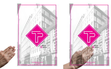
I have asked Rose, from screen-printing, and she told me it is possible to print on tracing paper (which is semi-translucent). She’s not very sure about acetate, because the paint may scratch off or be wiped off easily, but I still want to try, because I want to make sure that the texture underneath is really visible (that’s the cool effect that should make my poster unique).
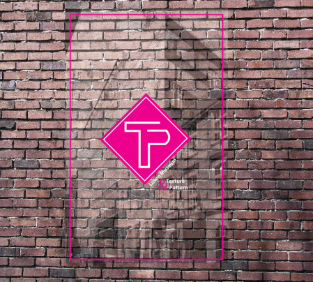
I also decided I wanted to print, in very low opacity, some pictures of buildings in Luton. I went around to take pictures, mainly of our studio building because I imagine the museum to be around this street. I will see how I can incorporate it to my design, so people can see the texture of the wall, the shadow of the building, and then the design, very vividly on top.
I experimented a little with my logo; see how many versions of it I could make, so I had a little variety to decide from. I wanted to incorporate the art-deco ideas in the line art, so they looked like neon lights.
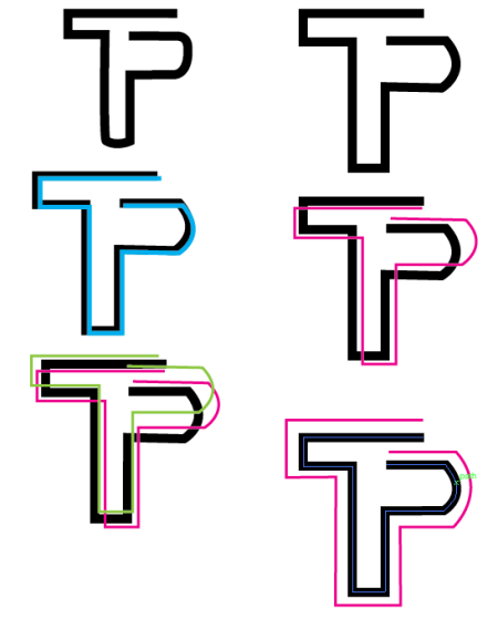
While I liked some of these designs, I do recognize that they look a little too complicated. I also thought how much harder it would be to screen print them, especially if they had different colors, so I decided to keep it a little bit more simple. I used the plain design and then developed it.
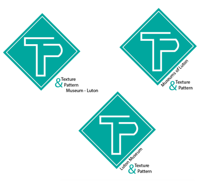
In order to make it look like a logo, I decided I wanted to have the symbol inside a shape. I tried with some squares and diamonds, to see which one looked better. I also altered the colors to have a little bit of variety.


I really liked how the logo looked with the diamond. It was very bright, and also very striking. I think this visual is the kind of thing I was looking for the logo. I also can see how this would become a very identifiable shape for the museum branding purposes.
I did some other versions of the diamond, only so I could have more variety. At the same time, I decided on a color palette (even if it’s not the definitive one). I made sets of logos so I can present them in class, and depending on the feedback, I can later decide which one I want for my final poster.


I also needed to find a complementary type for my logo’s text. I decided to use one that would look very simple, so it wouldn’t take attention away from the main visual. I am still struggling with the positioning of the text, and also the size of it. It needs to be visible, but I don’t want it to be too big either, because the poster would already have too many elements. I will consult with my class on which version is more appropriate.
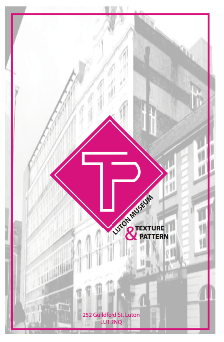
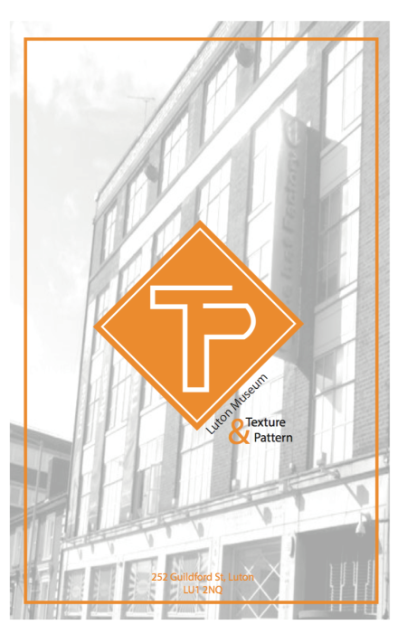
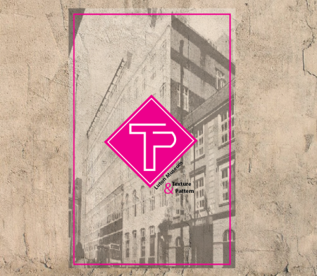
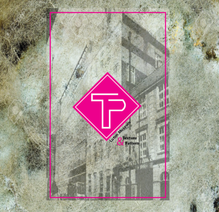
Finally, I decided to make digital versions of my posters. This will obviously be screen printed, probably next week. These are only a test to show my classmates how the poster idea would work. Although they are not final versions, they do resemble a lot the idea I had for them in the first place, and it is really nice seeing my designs come to life from me head. It took some work and some design decisions, but I am very happy with how they turned out.
I realize they will need some final corrections before I can print them. My peers haven’t heard any of my ideas yet, because I missed the last session before spring break, and I’ve been working on these by myself (with the help of my friend Hannah, who gives me ideas and helps me correct some things). I have done a lot of work, and it has been nice seeing how an idea can evolve from the very first sketches, and actually beg in coming to life. This has been one of the most difficult projects we have done so far, but I think it is also one of my best ideas and designs. At least from where I started, with the psychological states poster (which I also screen printed on a unique paper), I can see how much I have evolved. Starting with the fact that I did a lot of research and development with this project, and also that I have been putting to use the things I’ve learned, like hierarchy, composition, type, size, etc. This are skills that you don’t realize you’re learning until you’re working on a different project and you begin realizing that maybe if you change the size or placement of an element, it makes it look better all together. I have also started following the design-method much more than at the beginning. I actually took the time to sit down a couple of times, just to scamp ideas. I did much more sketches than those I’m used to, and I waited a long time before jumping on to the computer. I do like seeing that kind of development, because from where I started, to now, I do see the improvement. Mostly on the way I work. And this way of organizing will stick with me forever throughout my design career, and I’m very excited for it.
These are my poster designs, which I will polish after the crit. We are almost done with the semester, and I am very happy with the turn out of this project.