
After last crit, I had to re-think my entire concept. While everyone loved the idea of the translucent poster (and I was encouraged to screen print it), they also thought I over-designed everything.
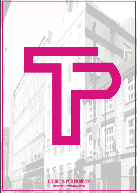
My lecturer loved the logo, she said that it was a brilliant visual… but that once I added the diamond and the lines and the complementary text, it lost it’s powerful impact. Now that I look at my designs, I think she might be right.
I had so many ideas going on, so much inspiration (art deco, neon, texture, translucency) that, in my attempt to use them all, I over-complicated everything. Instead of creating a very striking visual, I had too many things going on, in too many different angles. And with all the text and all the decorations, it loses its appeal (which is the main point of my design, so it really concerns me).
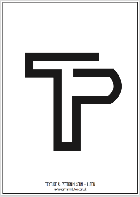
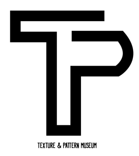
Some observations were made. They told me to loose the shape imprisoning my logo, because it was beautiful the way it was, and it needed no decorations. I agree, I think the logo itself, accidentally, was powerful enough by itself. I also noticed that, if I had left it inside the shape, the piece that would’ve been screen-printed would’ve been the shape, and not the logo, so the striking effect I wanted for it would’ve been completely lost. I was recommended to loose the type as well, and keep it very simple.
At the end, I had to take a very gigantic step back from all my overly designed versions, and just go back to the basics. It is actually really funny how, after having an idea and thinking about it, and making a lot of experimentation to create a developed design… the one you started with turns out to be the answer.
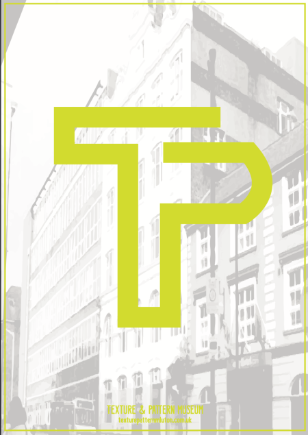
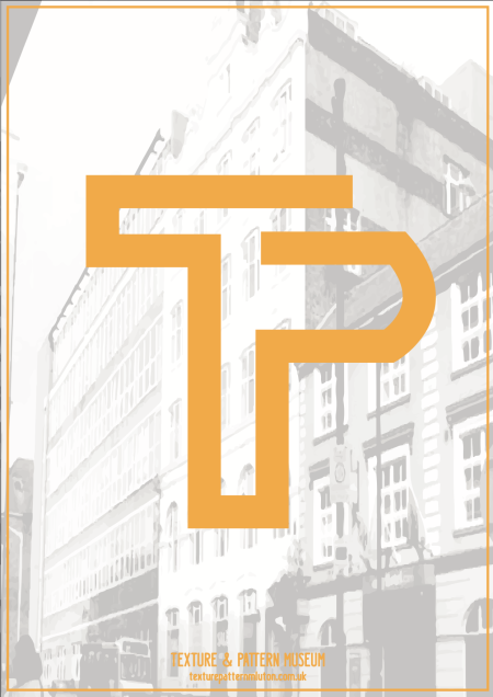
Since my logo was very strong and very beautiful, that will be my centerpiece, as it was supposed to be from the beginning. I also changed my color palette to make it completely neon (I had already arranged to use neon paint in my prints). I left the city images in the background just like in my previous design, but it is incredible how much it changes when I take off all the unnecessary ornaments. I also decided to, instead of having my logo in the center of the poster, in a medium size, to just make it gigantic, poster size, so it is actually the centerpiece of the design.
I changed the artwork in illustrator, and it’s impressive how much it changed from the previous versions. And it looks so much better.
It is really hard to tell when you’re over-designing and when you haven’t designed enough. That’s where the crits come in so handy. It is always wonderful to listen to other people’s opinion in your work. You don’t always have to follow, but it is so helpful to see your design from other’s perspective. It made me understand that I had put too much in my poster, and that it could be so beautiful and so much more striking if I only take out a few elements.
I have already revised this design with my lecturer, and she liked it very much. This is then my final design for the Texture and Pattern museum. Logo and poster.