
I came to screen print my poster on tuesday, and then again today (because it takes overnight for the paint to dry).
I thought of printing the buildings, in light opacity, and then screen-print the logo design on top. However, Rose, the technician, told me we didn’t had a printer that printed on to acetate, especially not acetate as big as the one I bought online.
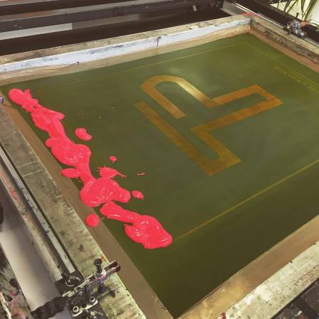
I then had to screen print both the buildings and the design. We used half-tone to make the buildings, and then expose the screen. Since it was not completely opaque, the design didn’t developed sharply into the screen, but that was the effect I was looking for.
Also, since I had only screen printed one time before, and back then, I had to cut out the shapes out of black card, I wasn’t aware you can actually print your design, and then expose the screen with it. This made things SO much easier, and also encouraged me to screen-print more of my projects in the future. I may even come back during the summer to develop some t-shirt ideas I have.


I was only able to screen print the first layer (the buildings) during the session on Tuesday, because it takes so much time and work that, by the time I was done with it, it was almost time to leave.
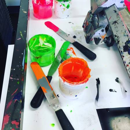
I did some prints on the acetate, and some others in the tracing paper. They both looked good. The paint did stick much better to the tracing paper, as Rose told me before, and the design was almost imperceptible on the acetate, because of how clear it was. I had to mix the paint with more medium to create that effect and make sure it was not too opaque. Also, I was able to do most of the process by myself, with a little bit of help exposing the screen, and also, my friend Nik helped me screen print, mostly because I am not strong enough to print hard, so the entire design shows. This has proven to be a little bit of a problem with screen-printing and me; I need a little bit more of physical strength for future projects.
I then came back the day after to print the second layer; this one was the logo design. It was much faster, because the screen was already exposed from the day before. I mixed the neon colors I wanted to use (pink, orange and green) with medium, and then started with the print.
I also decided to leave the margin in the design, so it could serve as a guideline for people to see that the poster is there and it’s a composition, rather than just a logo printed there for the sake of it. I think it highlights the logo so much.
Surprisingly, this time the paint didn’t stick too well to the tracing paper I had done before. It made the material wrinkle, and the design was barely visible. This was shocking because I thought it was going to look better on tracing paper (the building design did) whereas the acetate didn’t hold up so well with the buildings. I decided to try printing the logo on the acetate, and bingo!
Not only the paint stuck perfectly, but also the design underneath was visible enough without it being distracting, and the color was sharp and opaque enough to look like actual neon. I was so pleased with this (it actually looked just as I imagined it) that I left the tracing paper alone and finished my posters with the acetates. I only printed three, one of each color, but the result was perfect, and by the end of the day, I had my series of posters ready for the final presentation.
I couldn’t take pictures of the posters as they were drying out, but I took them once they were hung on the wall. The result was just gorgeous, even better than I imagined. I am so pleased and so satisfied with them, I do believe this has been my best project of the year, and I like how it reflects the work I put into it, and how it also shows how I have improved ever since the first project. I now have more experience and I know how to respond to problems of positioning and composition. I think this project was perfect to make me realize I have grown as a designer, and I have refined my abilities as well.